Serene
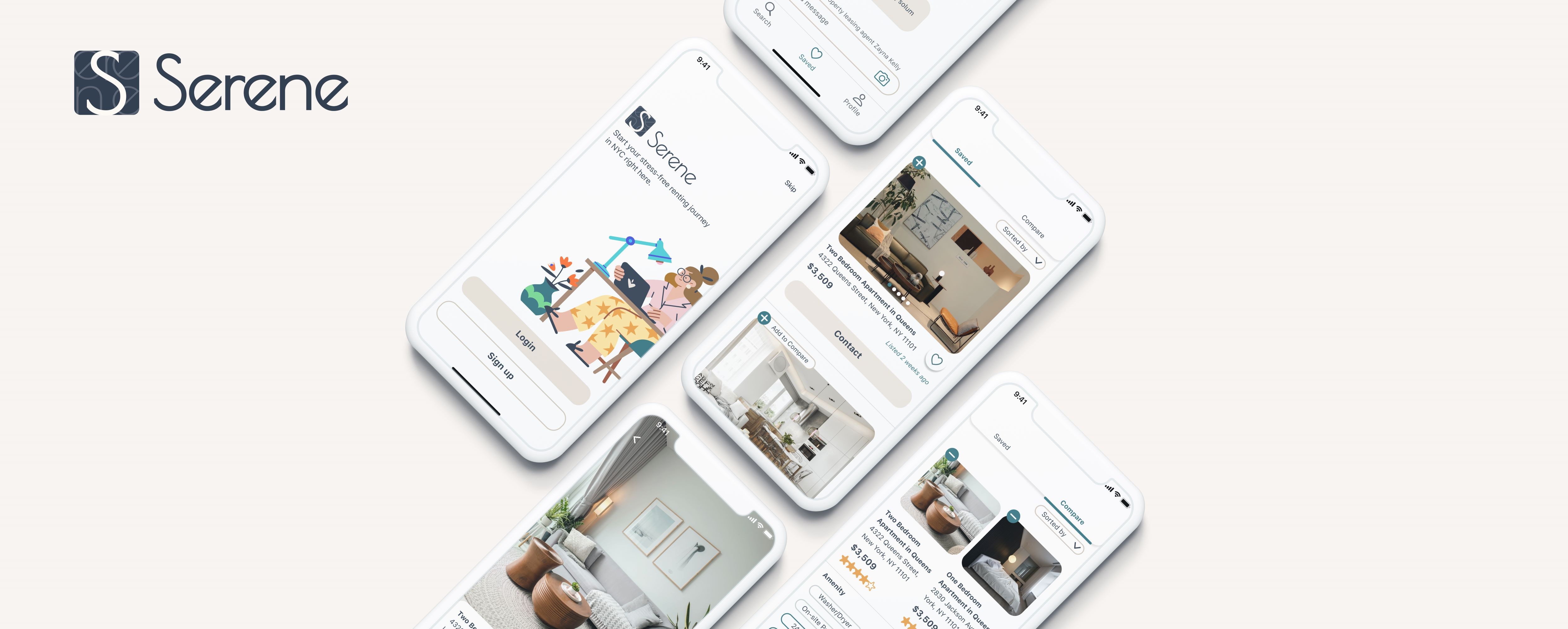
Serene is a rental listing app designed to assist all users who wish to find their new rental apartments in New York.
UI.UX
Alice Liu
Role:
Student Project
Date:
Sep 2021
Duration:
5 Weeks

Overview
New York has more than 5.4 million renters, according to the New York Times 2020. The state is constantly updating the law on renting, rendering the rental process complicated and wearying. Renters in New York often face the dilemma of starting the renting process from scratch, with no previous knowledge of the rental market.
Organized Information
Listing information should be organized in a way that does not overwhelm the users.
Increase Efficiency
Useful functions enable effortless comparison between different listings.
Delightful, not Stressful
UI patterns and interface should make the renting process enjoyable rather than depressing.
User Research
User Interview
What do renters find difficult when renting apartments in NY? How do people decide what kinds of apartments they want and need?
I interviewed 5 amazing participants with these questions in mind. Each interview lasted 45 minutes. The interview questions were loosely structured for me to understand the users’ habits and thoughts about the renting process in New York.
Conclusion: Users found the process to be complicated and messy. They often seek help from rental listing services, such as listing app.
Affinity Diagram
The affinity diagram helped organized the patterns of users' behaviors and pain points. I was able to empathize with each user to understand why they experienced each pain point.
Based on research, I generated the persona and their user stories.
Iterative Design Process
Usability Testing & User Flow
Iteration and usability testings are started early in the design process. To solve the problems identified from the user research, I conducted usability testing at every stage during the design process. Each round of usability testings contained five new participants performing a series of tasks using the Serene prototypes. It is essential to get constant feedback on changes and updates of the design.
User flow is used to identify users’ interactions with the product, creating an organized hierarchy for the features of the design. A user flow effectively helped me understand the steps users typically take to complete the tasks toward a successful outcome.
Style Guide
Identifying the brand attribute and brand personality is essential for creating a style guide. Serene tries to be a powerful and friendly tool that provides users with a hoslitic range of information about rental properties. The style guide was built based on the brand vision that every renter in New York deserves a stress-free renting process.
Guerilla Usability testing
I conducted five guerilla usability testing using early sketching. Each participant was asked to perform some simple tests using a paper prototype. Iteration was then made to improve the user experience.
Introducing Serene
Serene is a rental listing app designed to assist all users who wish to find their new rental apartments in New York. From searching, comparing to contacting, Serene provides a comprehensive range of helpful information and powerful functions to help renters make decisions, regardless of their previous knowledge of the rental markets. I strived to achieve all goals and eliminate obstacles found during early usability testing and guerilla usability testing.
Increase Efficiency
The “compare” function enables users to conviniently choose between two listings they like. Usability testing demonstrated that users are able to understand the function and distinguish the features of each apartment using this function within a short time.
Organized Information
There is a consistency among listing cards that contain essential information such as apartment address, net effective rent, last update time, and a “contact” button. Users from the usability tests are able to quickly familiarize themselve with this design and find the piece of information they are searching for.
Delightful, not Stressful
The design is consistent with the usability heuristic by keeping a minimalist design in all its page. The welcome page use a cartoon illustration to ilicite an enjoyable feeling. Users from the usability tests reported that the UI patterns feel friendly and welcoming.
Summary
I have learned a lot from my first capstone design project, from secondary research to primary research and a user-centered iterative design process. User research must avoid confirmation bias toward the product and eliminate presumptions about the product that could implicitly swing users’ behaviors and thoughts. More importantly, remaining an objective, indifferent attitude facilitates users to express their true opinion.
Designing a user interface is both fascinating and challenging to me. I had to learn and apply new knowledge simultaneously. Novice designers like myself often overlook consistency and accessibility, which are decisive factors to the overall usability. I have learned from the experience that it is essential to pay attention to every detail and to ask “why” to every decision I make along the way.


